Atelier Brand Studio
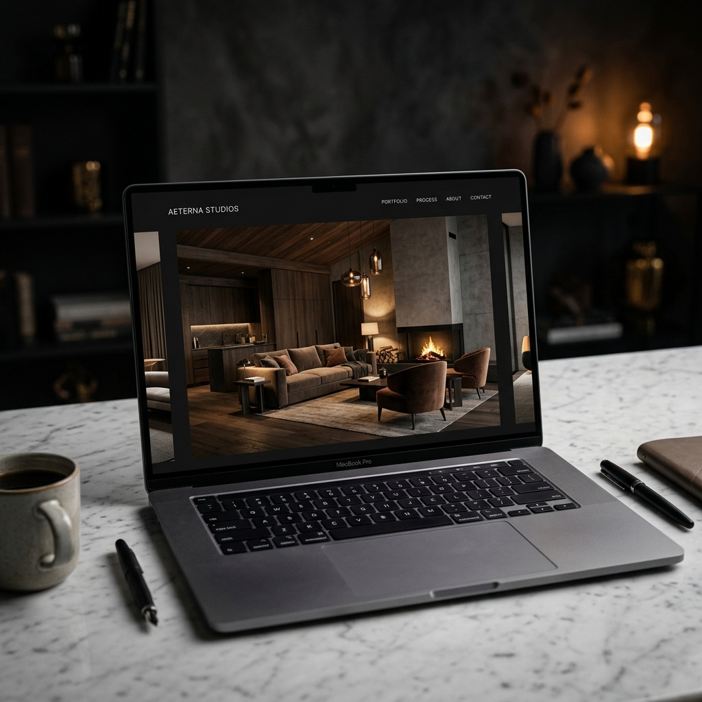
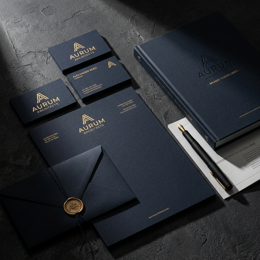
A comprehensive brand identity system for a multi-disciplinary creative agency. Print, digital, and environmental design — unified by restraint, elevated by craft. Gold foil, letterpress, and restrained typography.
Atelier had grown from a two-person studio to a team of twelve, but their brand still looked like a freelancer's portfolio. They needed an identity that communicated permanence, taste, and the confidence of a studio that chooses its clients as carefully as its typefaces.
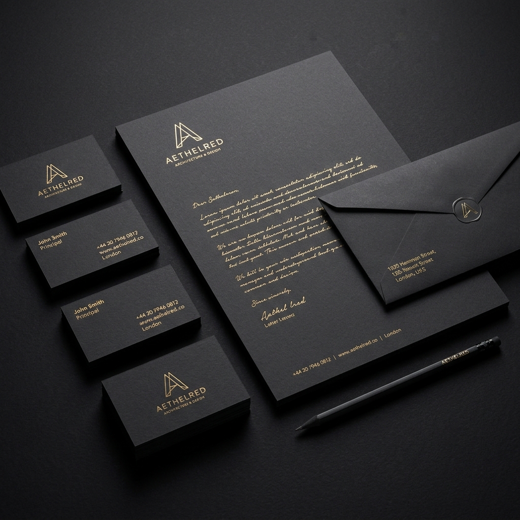

"Identity as architecture."
We stripped everything back to fundamentals. One serif typeface. One sans-serif. A palette of three colors: midnight navy, warm white, and a single gold accent. The logo is a monogram — simple enough to emboss, complex enough to reward attention. Every touchpoint was designed to feel like it was made by hand: letterpress business cards, foil-stamped stationery, a brand book printed on uncoated stock.
Interactive preview — move your mouse
- The rebrand attracted a different caliber of client — agencies and studios that valued craft over speed.
- The brand guidelines became a recruitment tool — designers wanted to work somewhere with this level of visual care.
- Print materials became conversation starters — the letterpress cards are kept, not discarded.
- The identity system scales cleanly from business card to billboard.
Wavelength Interiors